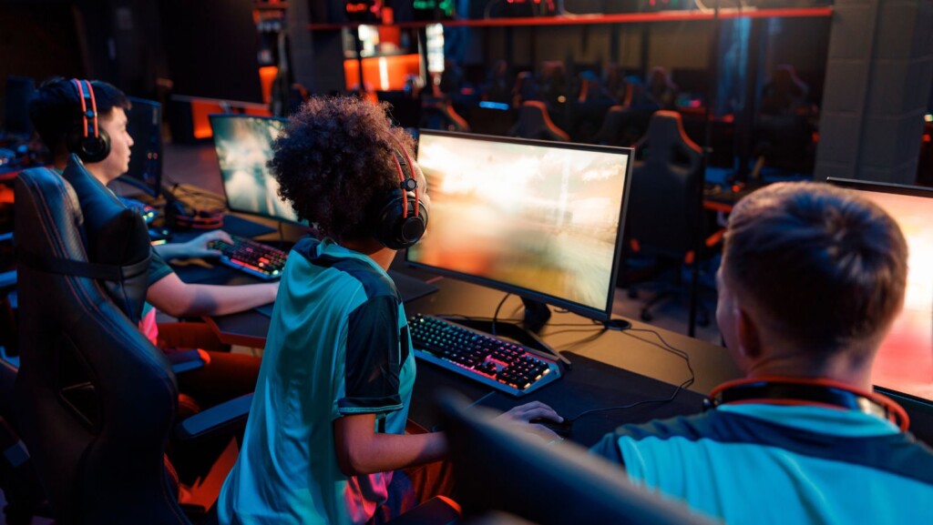
Gaming websites once competed for attention with loud visuals, animated banners and overloaded homepages. Bright colours and constant movement were treated as proof that a brand was exciting. Today, that approach feels dated. Players expect digital entertainment sites to look sharp, load quickly and guide them clearly from one action to the next.
For gaming brands, good design is no longer about creating the busiest screen. It is about building an experience that feels polished, trustworthy and easy to use.
First impressions now depend on clarity
Modern users make quick decisions. If a site feels cluttered, confusing or slow, they often leave before exploring what it offers. This applies across many sectors, from ecommerce and streaming to mobile banking and online education.
Gaming brands face the same pressure. A player landing on a website wants to know three things quickly:
- What kind of experience is being offered
- How easy it is to navigate
- Whether the platform feels credible enough to use
Flashy design can still catch the eye, but it cannot replace clear structure. A strong homepage needs visual personality, but it also needs obvious menus, readable text and clean spacing.
In web design terms, this marks a move from decoration to communication. Every colour, icon, banner and button should have a purpose.
Why older gaming layouts feel less effective
Many early gaming sites were built around spectacle. They used spinning graphics, oversized promotions and packed sidebars because the aim was to create instant excitement. On desktop screens, that sometimes worked. On mobile, it often becomes overwhelming.
The problem is not creativity itself. It is visual competition. When every element is trying to be the loudest, nothing feels important. Users have to work harder to understand where to click or what to read first.
Modern gaming brands are reducing that friction by simplifying layouts. They are using stronger visual hierarchy, better contrast and more predictable navigation patterns.
A cleaner gaming interface usually includes:
- A focused homepage with fewer distractions
- Game categories that are easy to scan
- Mobile-friendly menus
- Clear account and support areas
- Promotional sections that do not dominate the entire page
This design shift is visible across online casino platforms as well, where audiences are increasingly drawn to brands that feel organised rather than chaotic. A name such as crazyvegas casino can sit within that broader conversation about how iGaming design is becoming more mature and user-focused.
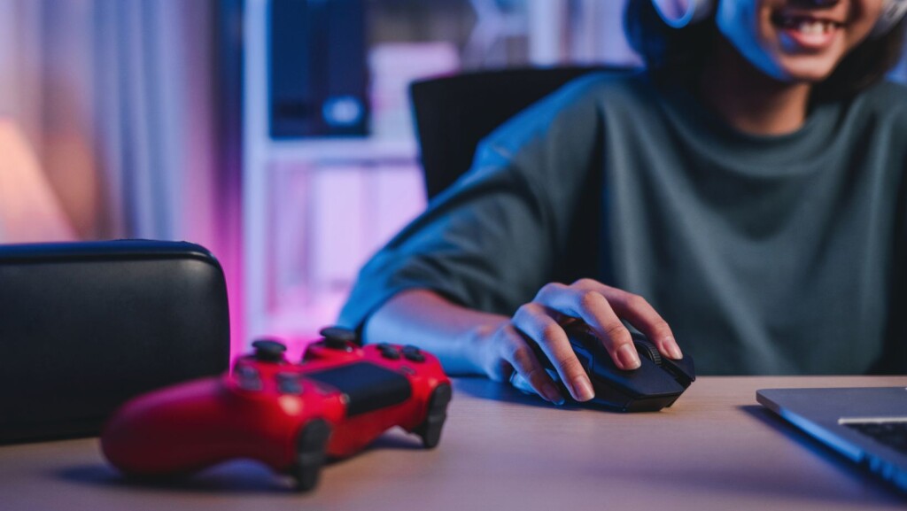
Mobile users changed the rules
The rise of mobile browsing forced gaming brands to rethink everything. A design that looks impressive on a large monitor may feel cramped on a phone. Buttons become harder to tap, banners push important content below the fold and animations can slow the experience.
Mobile-first design is now essential because many users interact with entertainment brands in short sessions. They may be checking a game library while commuting, browsing during a break or returning to a favourite title from the sofa.
That means gaming websites need to perform well in everyday conditions. The best mobile experiences are:
- Fast to load
- Easy to navigate with one hand
- Clear enough to read on smaller screens
- Simple to return to after interruptions
- Designed with account controls in obvious places
This has changed the role of visual design. Instead of adding more effects, designers are now asking what can be removed without weakening the brand.
Trust has become part of the visual experience
In online gaming, design is closely tied to trust. Users may not consciously analyse every visual choice, but they respond to the feeling a site creates. A polished interface can suggest professionalism. A messy one can raise doubts.
Trust signals do not have to be heavy-handed. Often, they appear through small design decisions, such as consistent spacing, clear labels, visible help sections and straightforward navigation.
Other industries have already shown the value of this approach. A finance app feels safer when account information is presented clearly. A travel booking site feels more reliable when prices, dates and policies are easy to understand. A food delivery app feels more useful when order tracking is simple.
Gaming brands can apply the same thinking. Players need to understand where they are on the site, how to manage their account and how to find support without confusion.
Design systems are replacing one-off pages
Another reason flashy design is fading is the rise of design systems. Large gaming brands now need consistent experiences across websites, apps, ads, email campaigns and social channels. A one-off flashy homepage does not solve that challenge.
A design system gives teams reusable components, such as buttons, cards, icons, menus and content blocks. This makes the brand easier to manage and the user journey more consistent.
For gaming platforms, design systems help with:
- Keeping game pages visually aligned
- Making promotions easier to update
- Maintaining readable layouts across devices
- Reducing design errors
- Creating a more professional brand identity
Consistency matters because users move between pages quickly. If every section feels different, the experience can become tiring. If the design language stays steady, users can focus on the entertainment itself.
The future is polished, not plain
Moving beyond flashy design does not mean gaming brands have to become boring. Personality still matters. Colour, animation, illustration and sound can all add excitement when used with restraint.
The difference is that modern design needs balance. A gaming website should feel alive, but it should not make users fight the interface. It should encourage exploration without burying essential tools. It should express the brand without overwhelming the player.
Gaming brands are learning that strong design is not about the loudest screen. It is about confidence, usability and flow. The most effective sites are the ones that combine entertainment with clarity, creating experiences that feel both fun and dependable.