A mobile app is judged in small moments. People notice whether the screen loads cleanly, whether the button text makes sense, whether instructions sound normal, and whether payment information appears before the user feels pushed into action. Design is often treated as a visual subject, but in real-money mobile services it also affects trust, patience, and caution. A crowded page can make users tap without thinking. A clearer page gives them enough space to understand what is happening. That difference matters when the app is connected with identity checks, payments, location rules, and private phone data.
The install path should feel readable, not rushed
Anyone planning to download parimatch app will usually form an opinion before reaching the login screen. The first judgment comes from the page layout, the wording near the install button, and the way the source of the file is presented. A user should not have to guess which button is real, where the file comes from, or what steps follow after installation. If a page uses aggressive prompts, vague labels, or too many redirects, even a working app can start with doubt.
This is where design and user safety meet. A clean install path does not need heavy decoration or loud promises. It needs visible information, steady spacing, and button text that explains the next action. People often download apps while moving between chats, banking alerts, and match updates, so the page has to work under imperfect attention. A well-built flow gives the user a chance to pause without feeling lost. That small pause can prevent a wrong tap, a fake file, or a careless permission approval.
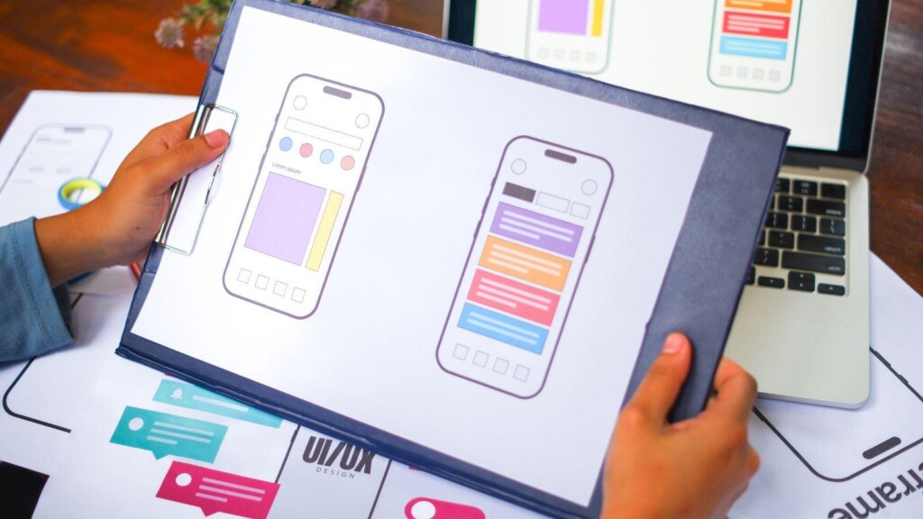
Visual clarity matters more than decoration
Good interface design does not begin with fancy graphics. It begins with order. A mobile screen has limited space, so every extra banner, pop-up, icon, and repeated button competes for attention. When the service involves money, that clutter becomes more than an aesthetic problem. It can hide terms, distract from warnings, or make users miss details about verification and payments.
A practical design makes the serious parts easy to find. The download source should sit where users can see it. Installation instructions should appear in a natural order. Payment and identity notes should not be buried at the bottom of the page. The design should guide the eye without treating the user like a target. That approach feels less flashy, but it usually creates a calmer first experience.
What safer mobile pages usually get right
A mobile page linked to real-money use needs more than a polished button. It should help the user understand the process before the app reaches the phone.
- The main install button appears once and carries clear wording.
- The file source is shown without making users hunt for it.
- Permission notes explain why access may be requested.
- Account rules appear before deposits or verification steps.
- Support contact details look consistent across the page.
These details may look ordinary, but they prevent the small mistakes that cause support complaints later. A user who understands the path is less likely to blame the product for confusion. A user who feels pushed may still install the app, but the trust level is already weaker. Design teams should care about that because the first confused minute often shapes the whole account experience.
Layout choices can reduce careless taps
A phone screen can make every action feel lighter than it is. One thumb movement accepts a permission. Another opens a payment section. Another confirms a choice that the user barely read. This is why spacing, button placement, and confirmation screens matter. A risky action should never sit too close to a casual one. The user should be able to tell the difference between reading information, starting installation, and agreeing to account terms.
Better wording keeps users grounded
Button text should say what happens next, not sell the action too hard. “Install file” is clearer than a loud phrase that creates pressure. “Read account rules” is better than hiding terms behind a tiny link. A good page does not scare people, but it does keep them grounded. The wording should sound like a careful product team wrote it, not like a banner trying to win a click.
Trust grows from ordinary design choices
The strongest mobile pages often feel almost quiet. They show the user where to start, what to check, and what to expect after installation. They avoid clutter because clutter creates doubt. They avoid pressure because pressure makes the product feel less serious. In real-money entertainment, those ordinary design choices carry real weight.
A user may never describe the layout in technical terms, but they will remember whether the page felt clear or suspicious. That memory follows them into login, account setup, payment, and support. A mobile app can still be fast and easy to use, but the first screen should give people enough room to think. Good design does not simply make the download smoother. It makes the whole product feel easier to trust.

